My Top Five Typography Tips
There are a few simple techniques you can use when setting type for your print or web projects which can make a world of difference to the overall legibility of the project. Many designers seem to forget that typography is more about legibility than about design. With the techniques described below, you can find a way to create well-designed typography that’s also highly legible.
1. Use Smart Quotes (curly quotes) – Nothing is more unprofessional than type set with straight quotes. Some software and add-ons (like spellcheckers) will offer a checkbox in their prefs for using smart quotes. Generally speaking, with most fonts in most software, smart quotes can be achieved by using the keyboard commands as follows:
- Beginning Quote = Option + Left Bracket
- End quote = Option + Shift + Left Bracket

2. Kern Your Puncutation – In most fonts, when you use a comma, period, exclam, or paren, there tends to be too much white space between the alpha or numeric character and the punctuation. Check your software’s help file docs and learn to kern your punctuation. Readers have been trained to know what to do when punctuation is encountered, for example, stop at a period or rest at a comma. Leaving the extra white space before the puncutation SCREAMS and inhibits smooth reading and legibility. In other words, the reader sees FULL STOP for a period and STOP for a comma.

3. Let Your Headlines Breathe – Try to remember each font, with its own unique letterform design, designates its own needs for spaces between letters. In other words, special settings for Helvetica may not work with Garamond. When your software’s type settings create very tight headlines to save space, and letters are touching and overlapping, it may inihibit the reader from getting through the headline. Studies show readers actually skim across the top of letters when reading, and skim headlines and sub-heads first, so set them with a bit more of an openset. As silly as it may sound, I check the settings for my headlines by squinting, imagining I’m a very small bug and trying to crawl through the headline. Anywhere I encounter and space between letters where I feel uncomfortable, I open-kern that spot.

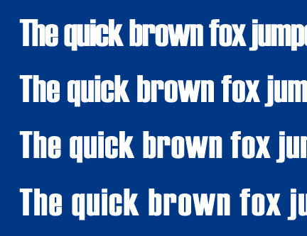
4. Learn To Use Test Settings – Whether you’re working in print or web, check your typography in context. Try different test settings of your type (particularly headlines) with different letterspace and leading (linespacing) settings. For print, set up your alternate settings on a sheet, print it out, place the sheet in context, and review it. (For example, if you’re working on a newspaper ad, print out the sample sheet and paste it into a newspaper, then flip through the newspaper seeing how your headlines read in context. For the web, set some different headlines within one graphic, place it on several pages, then click through the staging pages to see how the settings hold up within the framework of your site.)
5. Exceptions To The Rules – Most importantly,there are exceptions to every guideline I’ve mentioned, and learning when and where those exeptions are appropriate takes a good eye for type.

